Dummy
Bayes
Hive
Blog
About
Help
Sign in
Use BayesHive authentication
Email
Password
Remember me
Sign in
Register for an account
Forgotten your password?
Use third-party authentication
Google
Persona
If I had a penny for every time I heard someone say: "They should have plotted this on a log-scale!" then... I might not be rich, but I could afford several cups of coffee. Even the really expensive ones from Starbucks. Choosing a graph to represent your data is never easy. The switch from linear to log-scale can add clarity, but is itself be a more difficult concept. Most graph packages give you the choice between different axis scales, but that choice is made by the *presenter*; the *audience* has no say. This is necessarily true for graphs in newspapers and scientific journal articles, but it is also disappointingly true for most graphs found on the web. It doesn't have to be that way. Our data visualisation library [Radian](http://openbrainsrc.github.io/Radian/index.html) has grown an impressive suite of interactive styling options. These are now built into BayesHive's plots, so you will get interactive plots out of running models against your data. Alternatively, you can use Radian to plot data interactively on your own website. Here are two datasets, one following an exponential relationship and one a power-law. Can you tell the difference, by eye? >> setA <* sample $ repeat 100 $ prob >> x ~ uniform (-1) 1 >> y ~ normal (exp x) (((exp x)/8)^2) >> return (x, y) >> setB <* sample $ repeat 100 $ prob >> x ~ uniform 0 1 >> y ~ normal (x^2) (((x^2)/8)^2) >> return (x,y) ?>> aspect 2 $ besides ?>> [scatterPlot setA, ?>> scatterPlot setB] Go on. Put your mouse pointer over that plot. On a mobile device, try first clicking on the plot. On the left plot, you can switch the y-axis between linear scale, log scale and linear scaling from 0. Here's what it looks like: 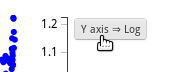 On a y-axis log-scale, the left plot looks like it fits straight line, indicating exponential growth. The right plot allows you to switch*both* the x-axis and y-axis between log, linear and linear including 0, because neither axis contains negative values. If you put *both* axes on log-scale, you again see the data fitting a straight line, which is the signature of a power-law relationship. If you want to lie with statistics, using a misleading graph is one of the best ways to do it. But what if the audience could directly manipulate the graph to get the view they wanted? Here is a graph of the stock price of IBM over the last year. It looks extremely volatile. ?>> axisLabels "date" "IBM price" $ aspect 3 $ wide $ plotStyle [("time-zoom", "off")] $ sigPlot (#ibm#close) If you switch the axes to linear (from 0) by clicking twice on the button that appears on top of the y-axis, then these changes look a lot smaller. The price fluctuations take the whole price into context. Here is a quote from [Wikipedia's guidelines](http://en.wikipedia.org/wiki/Wikipedia:Don%27t_draw_misleading_graphs): > The most commonly seen "sensationalization" of graphs in the popular media is probably when the graph is drawn with the vertical axis starting not at 0, but somewhere just below the low point in the data being graphed. Both upward and downward trends are exaggerated, for a more exciting look. This problem *goes away* when the reader can change to axis parametrisation on demand. Things get better for histograms. ?>> aspect 2 $ besides [axisLabels "Data value" "Frequency" $histogram $ map snd setA, axisLabels "gamma(1,1)" "" $ distPlot $ gamma 1 1] You still have the axis scale switches where it makes sense. But you also get to change the number of bins. Again, try putting your mouse over the graph and a little control for the number of bins comes up. I may have to start buying my own coffee.